Combining Assets & Camera Angles into Cards
Cards allow you to combine video sources, images, and text into a single asset. Then, during your livestream or recording, you can easily switch between different Cards with just one tap. Switcher Studio has several Card templates with various layouts and combinations that you can easily customize with your branding.

To make using Cards even easier, you can choose to have all new Cards automatically use your branding, by setting up your Brand Profile. By choosing the option to use your Brand Profile values by default, your Cards will automatically include your logo and use your brand colors.
Jump to:
Accessing Templates for Cards
Cards are available in the default horizontal app view as well as Vertical Video Mode.
Editing Example Cards in Vertical Video Mode
Vertical Video Mode automatically includes a few examples of Cards in the Sources panel. To customize any of the pre-populated Cards:
-
Tap and hold the card under Sources.
-
Tap Edit in the menu that appears.
-
That will take you to the Properties window where you can customize the card.

Accessing the Full Template Library in Horizontal or Vertical Video Mode
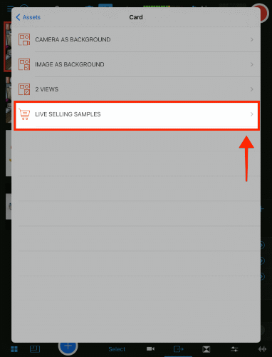
To access the full library of Card templates:
-
Tap the blue + button, located at the bottom of the Sources / Production panel.
-
Tap Card.

-
Tap the category you want to use.
-
Camera as Background will show templates with a live camera source behind everything else.
-
Image as Background will show templates with an image behind everything else.
-
Note: The dimensions for Vertical full-screen background Card images is 1080x1920 (9:16 aspect ratio).
-
-
2 Views will show templates with two camera sources or assets in a single card.
-
Live Selling Samples will show templates designed for showcasing products, highlighting collections and promos, and using countdown timers.
-
-
Scroll down to see all the templates for the category.
-
Tap a template to open the Properties window and begin customizing the card.
Overview of Template Elements
-
A grey checkered background indicates transparency.
-
A yellow background indicates a camera angle.
Customizing a Card
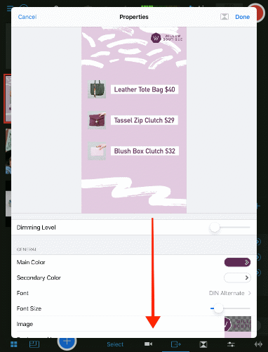
You customize a card from its Properties editor. The Properties editor can be accessed from either the example Cards pre-loaded in the Sources panel or the template library, as outlined in the previous section. To view all available options in the Properties window, scroll down from the top.
If you would like to create your own background to use with a card, make your image canvas 1080 x 1920 px, or 9:16 aspect ratio.
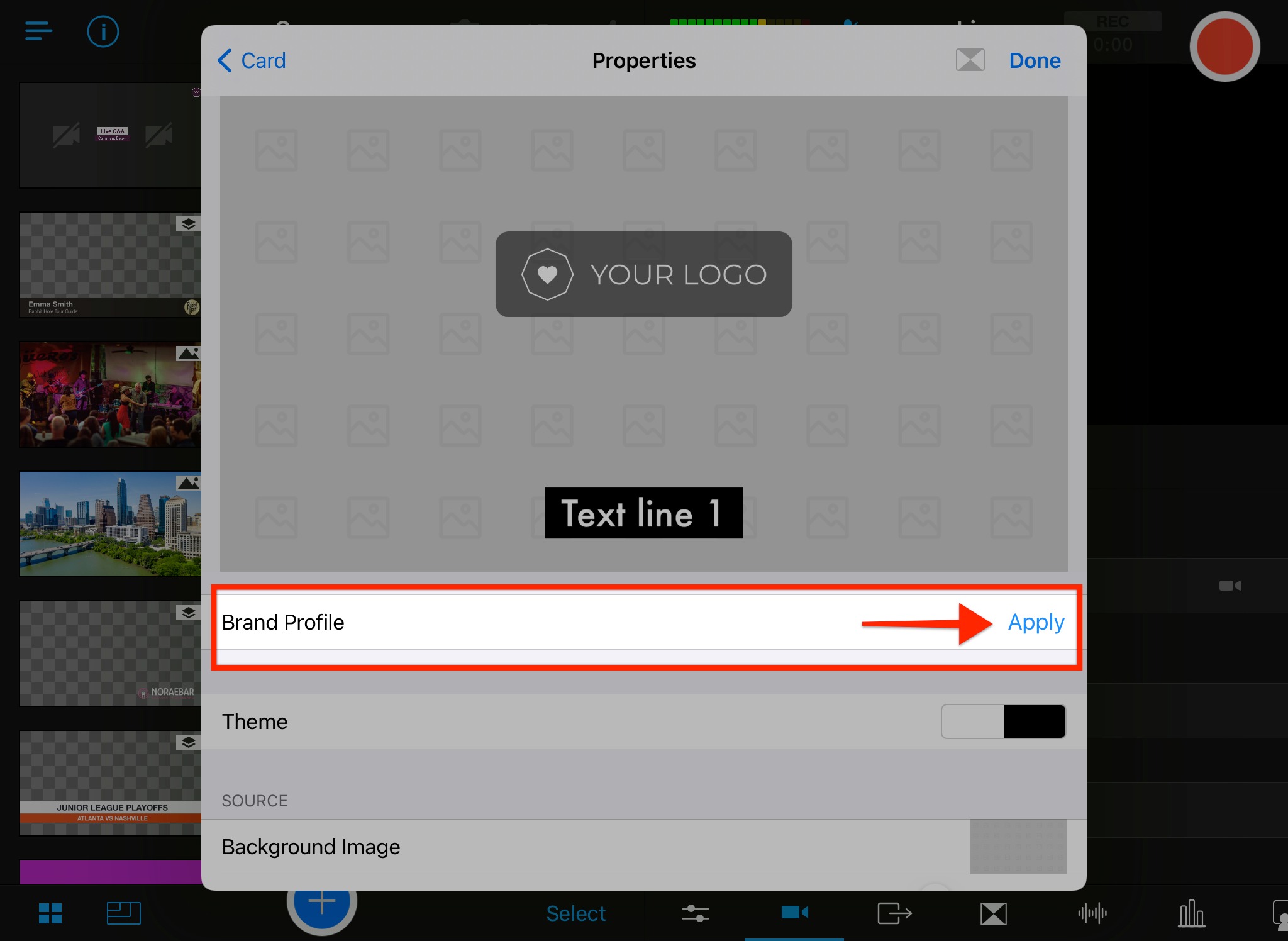
Using Your Brand Profile with Cards
When setting up your Brand Profile, you will have the option to select "Use Brand Profile values as default for all new templates." We highly recommend checking this box. If you do, when you create a Card, it will automatically insert your logo and/or use your brand colors.
If you do not check the box when creating your Brand Profile, you can still manually use your Brand Profile to customize a Card. From the Card Properties editor, simply tap Apply next to Brand Profile.
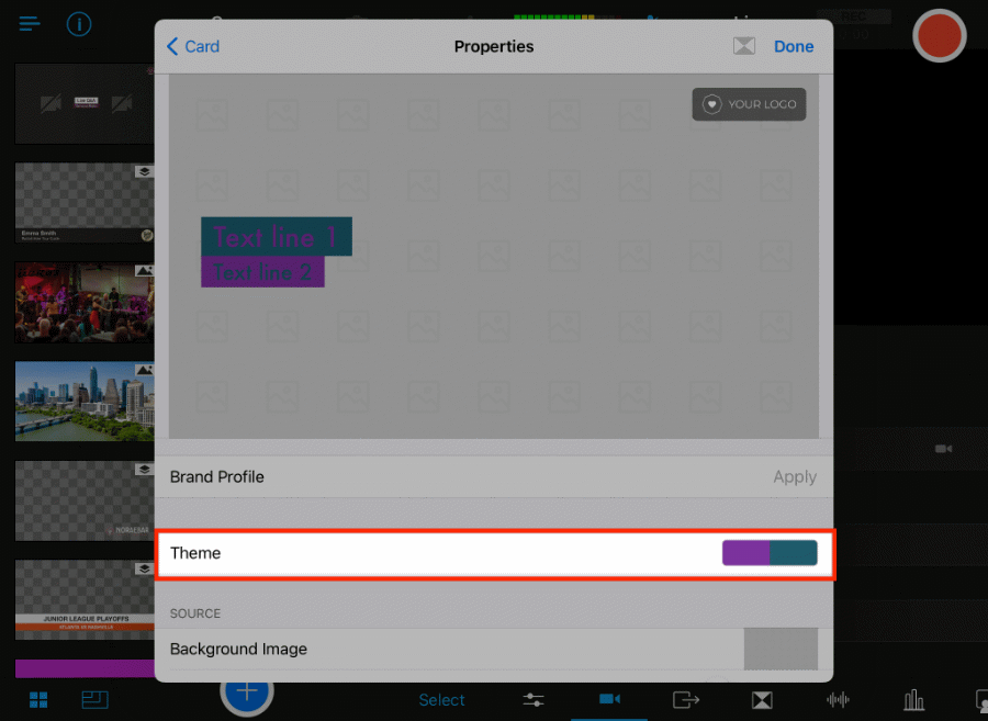
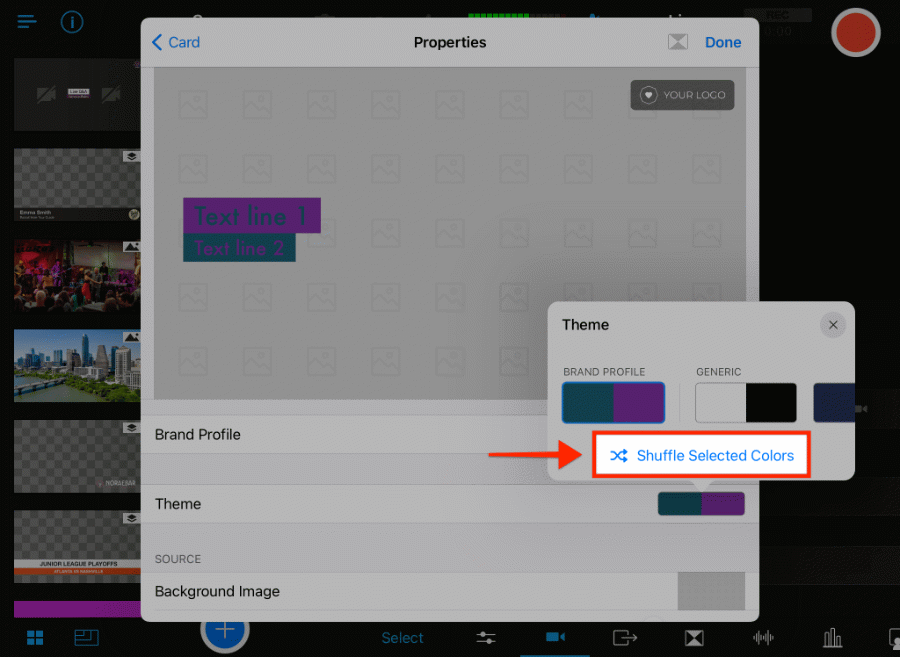
You can change which Brand Colors are used and the order they are applied, by using the Theme option in the Properties editor.
-
From the Properties editor, tap Apply if you have not already applied the Brand Profile.
-
Tap the color swatch next to Theme.
-
The Theme window will appear.
-
Tap Shuffle Selected Colors to change the order of the selected colors. As you make changes, the preview window will update in real-time.
-
Keep tapping Shuffle Selected Colors to toggle through all the options.
-
When you are happy with the colors, tap the X in the top right corner of Theme window.
-
Continue customizing the Card using the options below.
Understanding Card Customization Options
-
Dimming Level: Use the slider to adjust the brightness of the background.
-
Main Color & Secondary Color: Tap the color swatch on the right. Choose between using the Palette picker, RBG sliders, or color swatches. As you select a color, you'll see the CSS code change in the preview color box. Tap the preview color box at any time to type in a specific CSS color code.
-
You can save a color for future use by tapping one of the grey checkered boxes at the bottom of the color picker screen.
-
-
Font: The font options are based on what is available on the OS of your device. Tap the right arrow next to the default font to see the options.
-
Font size: Use the slider to adjust the text size. Slide to the right to make the text bigger and to the left to make it smaller.
-
Image: Tap the box to select an image file.
-
Background Image: Tap the box to select an image to use for the background.
-
If you do not have an image file that you would like to use, you can select from the Gradient options.
-
-
Text: Replace text by tapping on the text on the right next to Text 1, Text 2, etc.
-
The keyboard will appear.
-
Delete the existing text.
-
Type the replacement text.
-
-
Items Alignment: Tap between Left, Center, and Right alignment.
-
Production Groups: Assign it to an existing Production Group or create a new one to keep your Cards together in the Sources panel.
The Card preview will update in real time as you customize the properties. When you are happy with the settings, tap Done in the top right corner.
Note: Customization settings are only applied to individual Cards. Currently, it is not possible to apply global settings to multiple Cards at once.
Duplicating Cards
Duplicating a card makes it easy to create several similar-looking cards. To duplicate a card:
-
Tap + hold the card you want to duplicate in the Sources panel.
-
A menu will appear.
-
Tap Duplicate.

-
The new card will appear in the Sources panel next to the original card.

-
Tap + hold the new card to customize it.
-
Tap Edit.

-
The Properties window will appear for the new card.
-
Customize the new card as needed and tap Done in the top right corner.
Deleting Cards
Deleting Individual Cards
If you no longer need a card, you can delete it as follows:
-
Tap + hold the card you want to delete in the Sources panel.
-
A menu will appear.
-
Tap Remove.

Bulk Deleting Cards
If you want to delete several cards at once, here is how:
-
Tap Select in the lower right corner of the Sources panel.
-
Tap the cards you want to delete.
-
A blue checkmark will appear on the selected cards.
-
-
Tap the trash icon in the lower left corner of the Sources panel.

Reordering Cards
To rearrange cards, or any other assets:
-
Tap + hold the card you want to move in the Sources panel.
-
A menu will appear.
-
Tap Reorder.
-
The assets will begin to jiggle.
-
Drag the card to the desired location in the Sources panel.
-
Tap anywhere else on the screen when you are done reordering.
Note: Live sources, such as camera angles, will always appear at the top of the Sources panel and cannot be moved.
Related articles: